Connect Education
Find a solution to encourage students' engagement throughout the year and help them achieve outstanding results. 🤩
Introduction
Connect Education helps VCE (Victorian Certificate of Education) students learn and achieve more. They do this by empowering the top ATAR (Australian Tertiary Admissions Rank) graduates as mentors, creating everything from classes, to lectures and resources. They work hand-in-hand with some of the best schools and teachers in the state to support student learning.
They notice a pattern where students will only be actively engaged with the programme either mid-year or towards the end of the year around exams so we were tasked to find a solution to encourage students' engagement throughout the year.
My role
Researched on competitive analysis
Curated and conducted user interviews
Curated survey questions and synthesise the result
Created user persona
Produced user journey map
Defined the solution themes
Finalised features prioritisation
Sketched screen wireframes
Conducted user testing
Communicated technical aspects to developers and other stakeholders
Designed the final user interface design
3 UX Designers with UI Design, Marketing and Back-end Programming background.
My team
✍️ Understanding the business
Mentorship
Connect Education employ high achieving students from previous years as teachers for VCE workshops and classes.
Mission
Their mission is to help VCE students achieve their best possible result.
Curated notes
Their mentors curate notes for a number of VCE subjects to help students prepare for exams.
-

Strength
More comprehensive notes than competitors
High achieving past students as teachers
-

Weakness
Competitors have more traction in the market
Offer less subjects
Not in the digital market
-

Opportunity
Student teachers are more engaging
UI of competitors could been improved
-

Threats
Schools start with Connect Education before switching to Edrolo for their digital product
Competitors are more mature in the digital market
🗒 Key insights
Digital Opportunity
Connect Ed already have a strong face-to-face product, but their lack of digital product makes it hard to complete with businesses like Edrolo.
High achieving graduates
Connect Ed’s teachers (past high achieving VCE grads) are their biggest asset and differentiator in the market.
User interface
The UI of main competitor Edrolo is clunky and doesn’t make it easy for teachers/students to interpret information.
Studying user behaviour
We've been given a chance to speak to a few CE's current students and teacher. So I created the user interview questions and conducted phone and face-to-face interviews. As we managed to get some insights by talking to users and have some direction, I was more confident to move on to conducting survey to bigger audience pool.
User research
69%
Said they found practice Exams the most effective way to learn
21%
Students prefer 1:1 tutoring and class discussions
10%
Students prefer making notes
Biggest takeaway
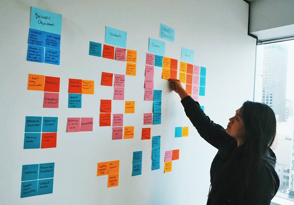
Affinity mapping
To synthesise the data from the user research, I facilitated affinity mapping activity so we could identify the patterns in user behaviour and use this information to guide us to our possible solutions.
As a result, we concluded the solution should based on these 3 themes: Motivation, Concentration and Confidence.
User research
Motivation
This has came up in survey and interview repeatedly. Students are struggling to stay motivated throughout the year.
Concentration
More than half the students surveyed said they struggled to stay focused and concentrate on study throughout the year
Confidence
Students aren’t feeling that confident that they’ll achieve their VCE goal
“Through the discovery process something else became clear: the needs of users and the goals of the business were very closely aligned.” 😍
Solution
After an extensive research, I have also found out that Practice Exams is one of the best learning method. Which led us to build our solution around Digital Practice Exam as a delivery platform.
Define
Problem statement
Currently, most students access Connect Education’s services either mid-year or towards the end of the year around exams. However, for students to get the best learning experience and the most value from the services Connect Education offer, they need to be engaged consistently throughout the year so they can build on their learning.
“Life satisfaction is 22% more likely for those with a steady stream of minor accomplishments than those who express interest only in major accomplishments.”
— Orlick 1998
🎨 Design features
Setting goals
Let users set their personal goals during onboarding process
Progress charts
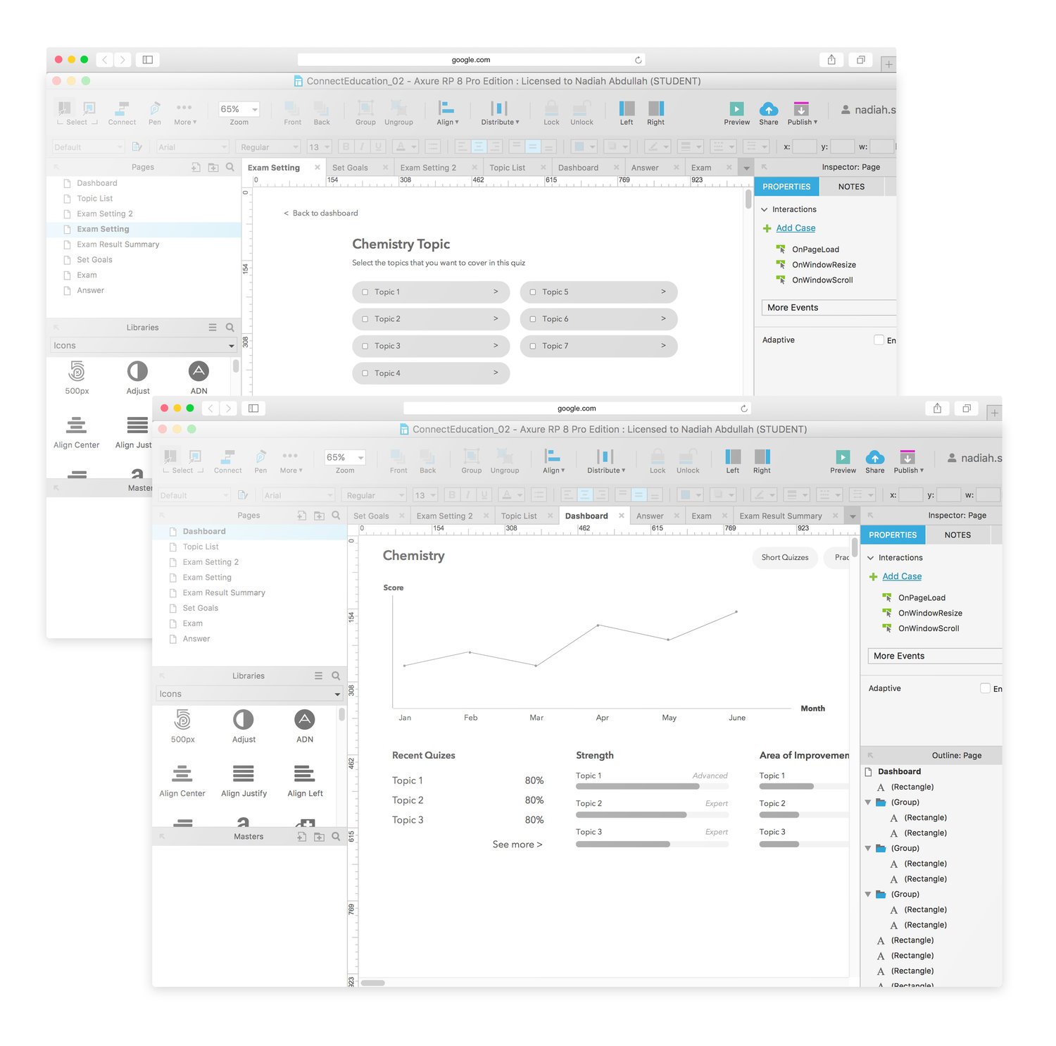
Provide graph that shows student’s monthly practice exam score
Result summary
Include a quick overview of result after exams to show how well they’ve done
Quiz
Multiple choices answer
Has guided answer
Practice is not timed
20 questions
Allowed to choose topics
Unlimited quizzes
Results won't appear on dashboard graph
Practice Exam
Multiple choices answer
No guided answer
Practice is timed
50 questions
Not allowed to choose topics
Available once a month
Results will appear on dashboard graph
Feature prioritisation
As time is crucial while building an MVP, and there is always a tendency of scope creep happening, I suggested for our team to conduct a Feature Prioritisation exercise.
It's divided to 4 categories - essential, nice to have, high effort and low effort. Features that goes under essential and low effort intersection will be our priority upon building the solution.
Planning
User flow
Design studio
-

As we are clear with the main screens that need to be designed, I conducted Design Studio exercise.
-

We focus on Practice Exams and Dashboard to help generate ideas on how the screens can look like.
-

I always find this exercise very helpful while looking for the breakthrough in solving problems.
Sketches
Moving on from low-fidelity sketches, I created medium-fidelity wireframes on AxureRP.
As we are building the prototype, I constantly conducted guerilla testings to validate the flow we created, and actually went through few rounds of iteration before we were confident to put it in front of actual users to have it tested.
Wireframing & prototyping
What users liked? 🥳
The detailed results screen.
The strength and weakness sections.
Position of practice exams and quizzes buttons are easy to find.
Answer in video format.
Discuss and share questions function.
What users disliked? ☹️
A lot of confusion around what the ‘levels’ meant.
Found dashboard contains a bit too much of information.
Recent Activity section on dashboard isn’t clear.
The summary of result page, the class average graph isn’t clear between individual graph and class average.
Usability testing
Next steps
Next steps
Next steps
I created a product roadmap that is segmented into 10 months timeline and high-fidelity user interface design.


