Finder Finance
Design an educational cryptos and shares investment platform for beginner investors 🚀
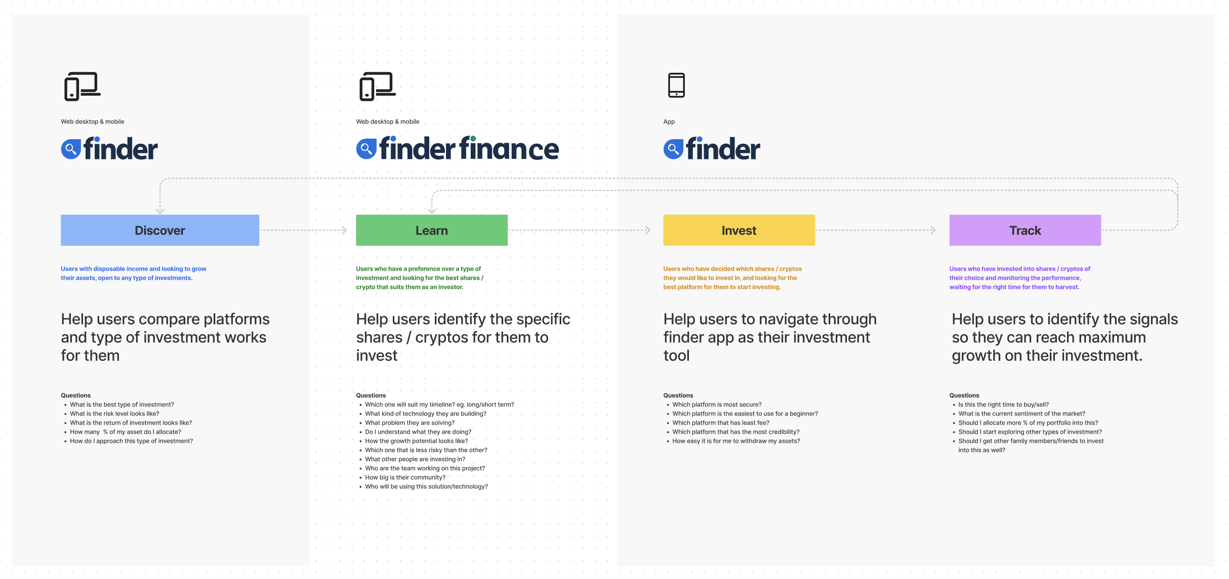
Concept and ideation
Prior to me joining the team, they have previously conducted user and market research to grasp user pain points and the gaps in the market. There are a few learnings that shaped the direction and the objectives of Finder Finance.
Introduction
🎯 Objectives
Balancing business and user goals
The business initially wanted to focus solely on crypto. But after further research, Australian users are quite cautious and still trying to familiarise with the idea of crypto investment. Resulting Finder Finance to also adopt shares investment as part of the product.
Beginner investors
Existing Finder users have been identified as beginner investors based on the type of content they are consuming. So Finder Finance target audience is defined as beginner investors.
Globalisation
Unlike other Finder products which are more localised, Finder Finance is intended to be a global product to align with how the crypto market works.
“Finder Finance goal is to host 9000+ programmatic pages for coins and even more for shares (based on the region)” 📈
— Finder Finance Product Manager
My role
Ideation and concept validation
Wireframes and prototyping
Liaise with stakeholders globally (US, UK, AU)
Map out competitor analysis
High level end-to-end journey mapping
Usability testing
User interviews
High-fidelity user interface design
Design handover to developers
1 product designer (myself)
1 product manager
3 front-end developers
5 back-end developers
1 content producer
My team
Fragmented user journey

As part of my effort to understand how Finder Finance can live next to other Finder products, I started mapping out all the products and how they are intended to benefit Finder users. One thing that stood out to me was how fragmented the branding and the journey is between platforms.
Product mapping
Seamless transition
I brought this issue up to the stakeholders and started the conversation around making the journey a bit more cohesive. This has resulted the Finder app and Finder Finance team to collaborate a lot more, sharing insights, components and more importantly - sharing the same goals.

Feature mapping

Homepage
I started off with designing the homepage. I came up with the wireframes for the different states of the screen and translated it to high-fidelity user interface design.
Design

Light vs dark
There were some conversation of around having both light and dark mode, but as we are building an MVP we as a team needed to choose one. I fit this into the usability testing to get a bit more of understanding of users preference.
📝 Learnings
Information delivery
User liked how simple the information being presented, easy for a beginner to digest. They find it very intuitive, seems easy to use.
Aesthetically pleasing
Users find the interface very modern, they liked the graphic and subtle animation. There was quite an even vote between light and dark mode, we decided to go ahead with light mode instead as users described it as less intimidating and inviting.
New design system
While working on this project, the design team at Finder is simultaneously working on our new design system. Also from the result the whole journey mapping, we decided to lean into the existing Finder app design style for a seamless experience.

Desktop & mobile design
Homepage
With the change of direction and in effort to create a more seamless experience between Finder Finance and Finder app, the overall style has been pivoted closer to the Finder app look and feel.
“This is definitely something I would use, can’t wait to see it goes live.” 😍
— Participant in usability testing

Screen flow
Search

Asset details
The other big piece of Finder Finance is the asset details page. This is basically where users go to learn more about the assets they are interested in, and Finder’s money making pages.
Wireframes
✍️ Stakeholders feedback
SEO
Finder naturally leaning towards building content that is SEO driven. Means a lot of feedback from stakeholders influenced the design through the SEO lense.
Compliance
As crypto is generally a new type of asset, the regulations and compliance differs based on the region. Luckily, with experts advice within Finder we managed to get a holistic understanding of the regulations making sure we have proper disclaimers throughout the platform.
Standardised categories
The publishing team works quite differently based on the region they are in, which means some of the categories will differ too. But through Finder Finance we are looking to standardise these type of content.

High-fidelity UI
After multiple rounds of iterations and consulting stakeholders, I got to the point where I think we are ready for another round of validations. So I conducted usability testing to test these 3 tabs; Overview, Trade and Analysis.
Design
📒 Users feedback
Relevance
Users find most of the content that are being displayed is highly relevant to what they would be interested to learn before investing in an asset.
Modern user interface
Users find the interface very modern, they liked how well the information is being presented. They are aware there is a lot of information there if they need it, but by default the amount of information that was being presented by default was just right to manage their cognitive load.
Too technical
Although Overview and Trade page was getting a lot of good feedbacks from users, the Analysis page however would require some major iterations. Users find them too technical for their understanding and didn’t feel like they would benefit from it.
“I would consider myself an intermediate investor, but these information are just too technical for me.” 🤨
— Participant in usability testing

“As part of launching strategy, there’s balancing act required to make sure we are optimising the SEO performance to ensure higher Google rankings” 📈
Balancing act
User interface design
User interface design

Next steps
I continued to design other parts of Finder Finance eg. Search and Listing page, while the developers are working on the completed design. We were aiming to launch Finder Finance by September 2022.