Mobile First
Identify and prioritise top opportunities on Pet Circle mobile web to increase conversion rate. 🧐
70%
Pet Circle traffic comes from mobile.
30%
Pet Circle traffic is on the desktop.
1/2
While most traffic is coming from mobile, the conversion rate is only half of what we are getting from desktop.
My role
Gathered qualitative & quantitative insights
Recruited participants and conduct user interview
Conducted usability testing
Researched competitor analysis
Synthesised findings
Provided design recommendations
Wire-framed the ideas
Designed the user interface
Prioritised features for implementation
Designed experiments for validation and decide on success metrics
Planned squad roadmap to execute
1 Product designer (myself)
1 Product Manager
2 Front-end developer
1 Full-stack developer
My team
📝 Heuristic evaluations
Technical Issues
There were a few minor bugs that weren’t showstopper and have been deprioritised, but affecting the overall experience.
User Interface
Some features were built and shipped without designers' input as a result of low on resources causing reduced of quality in design decision.
Usability
Through previous user interview sessions, we discovered some features that need further attention but didn’t fit into the business focus within the quarter hence been deprioritised.
Major difference in the flow structure
Competitor analysis
After a few considerations with the stakeholders, we decided to benchmark against the biggest e-commerce businesses and focus on usability and flows vs to focus on pet supplies e-commerce. The next step was to come up with a SWOT analysis on key findings.
Industry benchmark
Survey
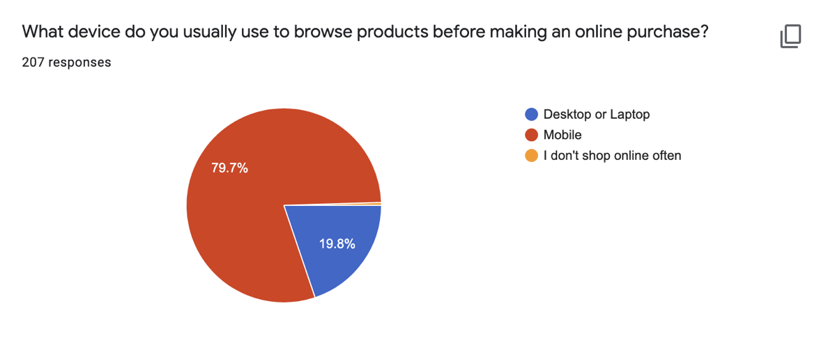
“While users’ preferred device is still mobile for both browsing and placing orders, we can see the 10% increase in users’ preference to place the order on the desktop”
— Survey insights
User interview and usability testing
We used GoPro setup to capture users interaction on mobile and conducted the testing with 10 Pet Circle customers.
What users’ day-to-day looks like?
By asking what our users’ day-to-day looks like, their shopping and browsing journey online, their common activities on mobile - they all look different from each other.
Define
“Though one thing that we noticed of what they have in common is all users have multiple interrupted sessions. ”
Desktop vs mobile
By asking what our users’ day-to-day looks like, their shopping and browsing journey online, their common activities on mobile - they all look different from each other.
Define
“If i had a choice between a computer and a phone in front of me, I would always choose the computer.” 😄
— Pet Circle customer
📋 Synthesising Insights
Natural behaviour
Desktop will always be users’ preferred choice if they have the option of mobile and desktop in front of them. The luxury of having bigger real estate that gives more confidence to users to complete a purchase is tough to overcome through small screen devices. This explains the higher conversion rate on desktops.
Lifestyle
With that being said, with the current modern lifestyle, mobile is the device that is available to users almost at all times.
Challenges
The problem with mobile is that users are naturally easily distracted by the surrounding environment. They are always on the go or doing something e.g watching TV, commuting or just being outside and about.
“Online shopping isn’t always a linear, one-session journey.” 😮
Redefining the problem
Users will drop off especially when they are on mobile and pick up where they left off when they are in a more suitable setting to complete their transaction, on the most convenient, accessible device that is available to them at the time.
Design
Purchasing pillars
How might we make it easier for pet parents to access their go-to products? 🧐
Experiment 1 • Browsing and navigation
We want to make defaulting easier for pet parents, and provide a quick way for them manage and track their orders.
Industry benchmark analysis
Bigger e-commerce like Walmart and Amazon surface their account management on the hamburger menu for easy access.
Customer service insights
In a previous conversation with the CX team, most of the queries they get with delivery tickets were customers asking about the status of their orders.
User research
Users’ first step in their thought process of purchasing something is defaulting. They will always go for products they are familiar with which falls under Previously Purchased.
-1.6%
Decrease in revenue per session
+11.5%
Increase in account creations rate
+5.9%
Probability to visit new added links
Concept validation through A/B testing
“We can expect an uplift of $9.6k in NCM per month in long term due to increase in account creations.” 🥳
Business impact
Result of making defaulting easier
We saw a significant increase to “Reorder Items” on the new design that can potentially contribute $10.8k to NCM weekly.
Final design implementation
How might we help pet parents to have all the confidence they need to make a purchase decision? 🤔
Experiment 2 • Purchase decision
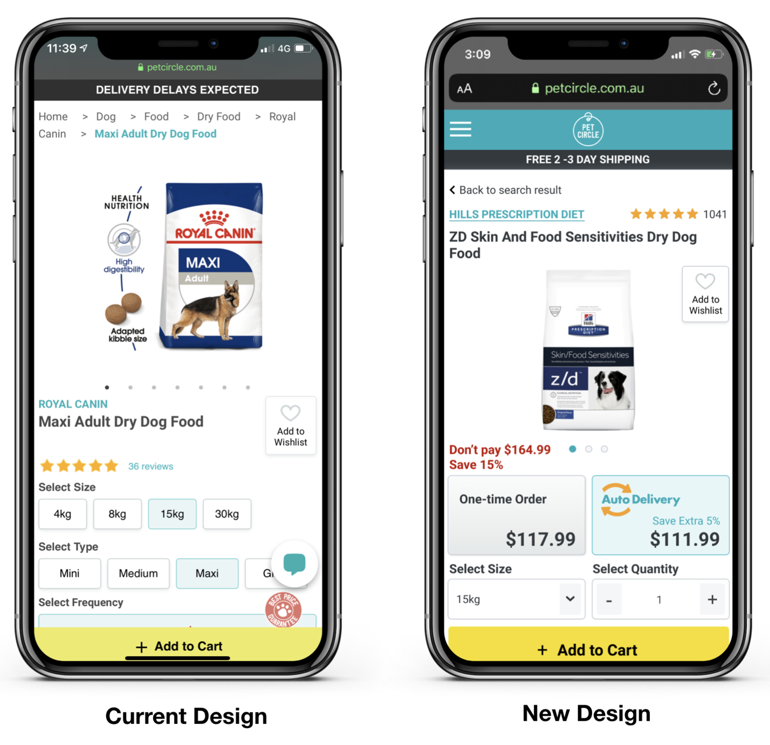
By decluttering product page and rearrange the information with the right hierarchy, we will reduce distractions and users will be able to focus on making the right purchase decision.
Hypotheses
-3.1%
Decrease in revenue per session
+0.4%
Increase in bounce rate
+0.5%
Increase to visited cart
Concept validation through A/B testing
“The revenue per session was almost significantly lower under the variant (close to 95% confidence) with a -3.1% variation vs the original.” 😞
As per the discouraging result from the experiment, this design recommendation weren’t implemented on production.
How might we let pet parents complete their purchases as quickly as possible? 🤓
Experiment 3 • Checkout
One of Pet Circle most valuable point to customers is missing the main CTA button.
“Over the years, as the team keeps introducing new features onto a page without taking a step back, we lost sight of what really matters to customers.” ☹️
Experience rot
Bring ‘add to cart’ button above the fold with clearer display on all the information will help customers to complete their shopping journey faster.
Declutter the ‘add to cart’ modal
Take up the whole page as mobile real estate is very valuable especially on smaller screens.
Design recommendations
+2.1%
Increase in probability on visit to cart
+1.1%
Revenue per session
Concept validation through A/B testing
“Given the uplift in the probability to visit the cart this could mean an uplift of $33.1k per month in NCM” 🚀
Business impact
Feature planning & prioritisation
Feature planning & prioritisation
Next steps
I created a documentation where I can keep track the list of the features and design recommendations for implementation.


